React Dropdown component
The React Dropdown component from Trend Micro is an intuitive and customizable solution for enhancing user interaction within applications. Designed to seamlessly integrate with React, it allows developers to create dynamic dropdown menus that can handle a variety of use cases, from single selections to complex multi-level menus.
With its flexibility in styling and functionality, the React Dropdown is not only user-friendly but also adaptable to meet the specific needs of different applications. Whether you’re looking to implement a simple dropdown or a more intricate dropdown menu wrapper, this component offers an efficient way to improve user experience without compromising on performance.
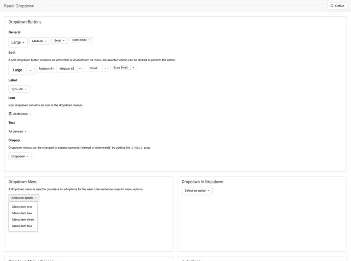
Custom Component Class: Easily change the root element of the dropdown using the componentClass property for full control over the structure.
Dynamic Menu Handling: Use properties like dropup and disabled to determine how the dropdown behaves, allowing for intuitive menu management that meets user expectations.
Callback Functions: Built-in callbacks such as onToggle and onSelect facilitate event handling, enabling developers to execute specific actions when dropdown visibility changes or when a menu item is selected.
Styling Flexibility: Leverage inline styles or styled-components to customize the appearance, ensuring the dropdown matches the overall aesthetic of your application.
Dropdown Menu Wrapper: The addition of a Dropdown Menu Wrapper provides enhanced control over styling and behavior, allowing for tailored dropdown experiences.
Configurable Alignment: Utilize the pullRight property to adjust the alignment of the dropdown menu, optimizing for various layouts and user interactions.
Multi-Level Support: Create complex nested dropdowns effortlessly, supporting hierarchical selections that enhance navigation for users.
Accessibility Features: Support for roles and ARIA attributes, improving accessibility for users with disabilities and ensuring compliance with modern web standards.