Accessible Accordion component for React
The evolution of web accessibility has ushered in a new era where traditional JavaScript libraries for components like accordions may no longer be necessary. This specific package, originally aimed at simplifying the implementation of accessible accordion components, has reached a point of being outdated as native HTML elements like <details> and <summary> have gained widespread support. These native options present several advantages, making them a far more efficient choice when it comes to performance and accessibility.
The shift towards utilizing integrated HTML disclosures allows for a cleaner, more streamlined way to handle content visibility without loading additional scripts. This project is no longer maintained but serves as a reminder of how web standards continue to evolve, allowing developers to lean into more native solutions for enhanced performance across various frameworks and devices.
Native HTML Support: Utilizes the <details> and <summary> elements, which are now widely supported across modern browsers.
Performance Friendly: No additional JavaScript is required for basic functionality, ensuring a lightweight and fast-loading experience for users.
Accessibility: Content remains discoverable via find-on-page (Ctrl/Command + F) capabilities, improving usability for diverse audiences.
Flexible Styling: Encourages developers to create custom styles while providing demo styles as a starting point.
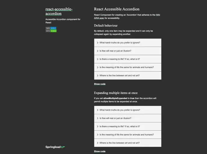
Component API: Offers various options, including allowing multiple items to be expanded or the ability to collapse the last remaining item.
Callbacks for Expansion: The onChange callback function can notify when accordion items are expanded or collapsed, providing better control over the component’s behavior.
Custom UUIDs: Supports external control over expansion states using UUIDs, though caution is advised to maintain accessibility standards upfront.
Semantic Markup: Allows customization of ARIA roles for better semantic structure, ensuring that screen readers can interpret the content correctly.