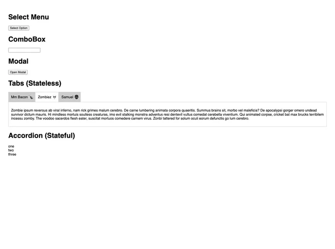
React Aria screenshot

React Aria

Author Avatar Theme by Souporserious
Updated: 15 Sep 2020
145 Stars

Utility components to help compose React ARIA components

Categories

Overview

React Aria is a powerful set of utility components designed to help developers create ARIA-compliant applications easily. It offers a seamless way to build accessible components in React, making it an essential tool for those looking to enhance usability for all users. By leveraging the principles of ARIA, the library simplifies the process of building rich interactive components while ensuring they remain compliant with accessibility standards.

This project provides various examples and tools that can guide both novices and experienced developers in incorporating ARIA features into their applications. The collaborative nature of React Aria allows contributors to continuously improve and expand upon the library, making it a vibrant resource for the developer community.

Features

  • Utility Components: Offers a set of essential components that simplify the process of building ARIA-compliant React applications.
  • Easy Installation: Quick setup with simple commands such as yarn add react-aria or npm install react-aria --save.
  • Building Block Examples: Comes with practical examples like building a select menu or organizing a set of tabs to help developers get started.
  • Local Development: Supports running locally through clear instructions, making it easy to test and develop components in a real environment.
  • Community Driven: Encourages contributions with an open invitation to file issues or submit pull requests, fostering an active and responsive development community.
  • Inspired by Experts: The library benefits from the foundational work of accessibility guru David Clark, ensuring high standards of ARIA compliance.