Tooltip component for React, Preact, Inferno
React-hint is a lightweight tooltip component designed specifically for React applications, prioritizing both simplicity and performance. With its compatibility extending to Preact and Inferno, this package is versatile enough to enhance tooltips across different frameworks. It makes adding tooltips to various elements a breeze, ensuring users can access informative content effortlessly.
The magic of React-hint lies in its easy installation and usage. By including it once in your top-level component, you can set it up to provide tooltips throughout your application, activated by easily customizable attributes. This makes React-hint a great choice for developers looking to implement tooltips without unnecessary complexity.
Simple Integration: Utilize a singleton component for tooltips, allowing you to manage them from a single point, streamlining your code.
Custom Content Support: Easily render custom HTML within tooltips using the onRenderContent prop, which provides flexibility for personalized details.
Dynamic Data Attributes: Tooltips can be activated using the data-rh attribute, letting you control tooltip content on a per-element basis effortlessly.
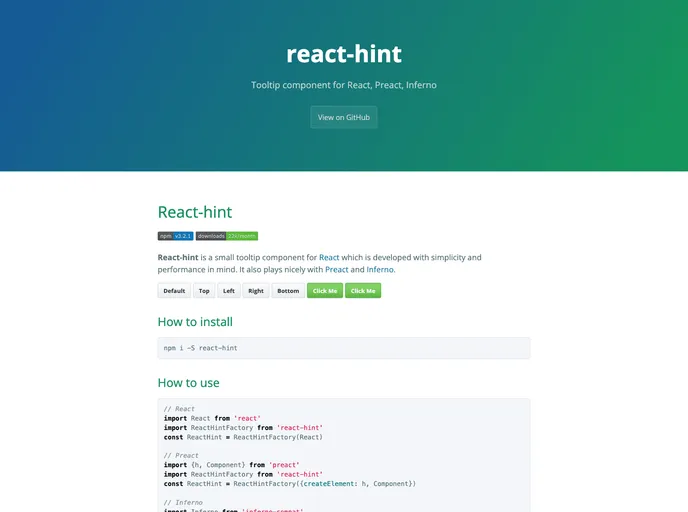
Positioning Options: Tooltips can be displayed on four sides (top, left, right, bottom) for user convenience and optimal visibility.
Autoposition Feature: Automatically adjust tooltip positions based on their proximity to the window borders, ensuring they are always accessible and visible.
Styling Customization: Override the default tooltip style by using the className property, allowing for unique styling that fits your application’s theme.
Event Control: Manage how tooltips respond to various events like clicks and hovers, giving you precise control over user interactions.
Persisten Display Option: Keep the tooltip visible until an outside click or hover occurs, which can enhance user engagement by preventing accidental disappearance.