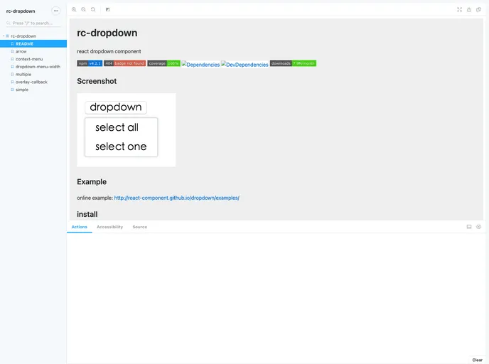
React Dropdown
The rc-dropdown is an elegant React dropdown component that offers a variety of features suitable for creating user-friendly navigation menus or selection options in your application. Its design emphasizes simplicity and flexibility, making it an excellent choice for developers looking for a reliable dropdown solution.
This component seamlessly integrates with the underlying rc-trigger component, allowing for extended functionality and customization to fit specific use cases. Additionally, the MIT license ensures developers can freely use and modify the component in their projects.
Flexible Integration: The component can easily be incorporated into any React application, allowing developers to create dynamic dropdown menus with minimal effort.
Customizable Props: Users can pass additional props directly into the rc-trigger component, enabling more control over the dropdown’s behavior and appearance.
Standalone Functionality: It supports display in a separate portal-driven window, which can enhance user experience by reducing UI clutter.
Test Coverage: The component comes with robust test coverage to ensure reliability and maintainability, making it suitable for production-level applications.
Lightweight: The bundle size is optimized to ensure efficient loading and quick performance, keeping the application responsive.
Active Development: Regular updates and active management indicate a commitment to improving the component and addressing any bugs or user feedback.
Open Source License: Released under the MIT license, developers can use and adapt the rc-dropdown in their projects without legal concerns.