Overview
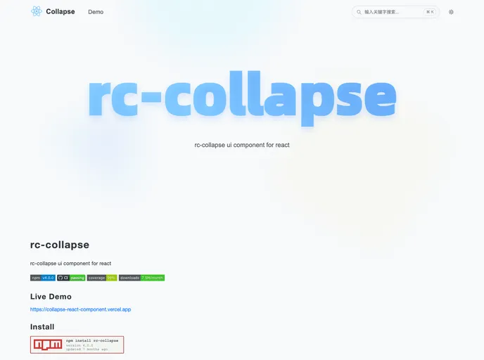
The rc-collapse component is a powerful and flexible UI component designed specifically for React applications. It simplifies the implementation of collapsible panels, allowing developers to create interactive and engaging user interfaces with ease. With support for multiple browsers and accessibility features, rc-collapse stands out as an excellent choice for those looking to enhance their React projects.
Features
- Cross-Browser Support: Compatible with Internet Explorer 8+, Chrome, Firefox, and Safari, ensuring a wide range of usability.
- Customizable Accordion Behavior: Easily toggle between accordion functionality; only one panel can be open at a time with a simple prop configuration.
- Dynamic Active Key Management: Allows for flexible control over which panel is open, accepting both strings and arrays for the
activeKey prop. - Keyboard Accessibility: Built-in keyboard event handling to enhance usability for keyboard users, with the option to disable this feature if needed.
- Streamlined Panel Management: Manage collapsible panels with ease, using an updated API that removes outdated props for a cleaner experience.
- Easy Integration: Simple to install and use within any React application, making it accessible for both beginner and experienced developers.
- MIT License: Released under the MIT license, ensuring developers can use and modify the component freely.
