Overview
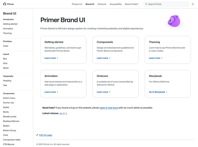
The Primer Brand libraries offer a foundational toolkit for developers looking to enhance their projects with a cohesive design language. Hosted on primer.style/brand, this documentation site serves as a comprehensive resource for getting started, utilizing components, and contributing to the Primer ecosystem. With a focus on ease of use, these libraries ensure that implementing stylish and functional UI components is straightforward for developers of all skill levels.
Features
- Easy Installation: Simply install npm and add @primer/react-brand as a dependency to incorporate the library into your project with minimal hassle.
- Comprehensive Documentation: The documentation site provides clear, detailed instructions to guide both beginners and experienced developers through setup and usage.
- Component Library: Access a rich collection of UI components that adhere to the Primer design principles, enabling a seamless user experience.
- Contributing Guidelines: Clear guidelines in the CONTRIBUTING.md file make it easy for developers to contribute to the project and enhance the library further.
- Release Process Information: For GitHub staff, specific documentation regarding the release process is available, ensuring a streamlined update methodology.
- MIT License: The libraries are open-source and distributed under the MIT license, promoting flexibility and freedom for developers to utilize the code.