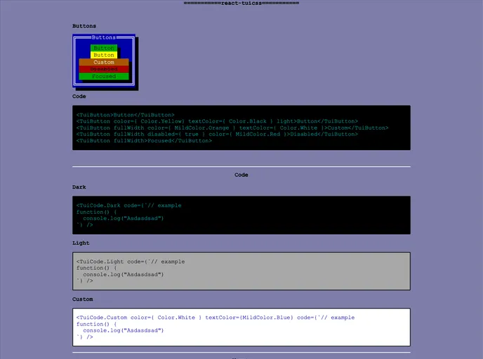
A reactjs component library based on TuiCss.
React-tuicss is a reactjs component library based on TuiCss. It is designed to provide a collection of components for building user interfaces in React applications. The project aims to improve accessibility and focus states for radio and checkbox components, and the developer expresses an interest in gathering feedback and potentially expanding the library in the future.
To use react-tuicss in your project, follow these steps:
Install react-tuicss using npm:
npm install react-tuicss
Import the styles as one of your first imports in your React application:
import 'react-tuicss/dist/main.css';
Start using the components from the react-tuicss library in your React components:
import React from 'react';
import { Button, Checkbox } from 'react-tuicss';

const MyComponent = () => {
  return (
    <div>
      <Button>Click me</Button>
      <Checkbox label="Agree to terms" />
    </div>
  );
};

export default MyComponent;
React-tuicss is a reactjs component library that provides a collection of components for building user interfaces in React applications. It offers improved accessibility, particularly in the focus states for radio and checkbox components. The library can be installed via npm and easily integrated into existing React projects. The developer expresses an interest in gathering feedback and potentially expanding the library in the future.