React SDK for Farcaster components - powered by Neynar APIs
The @neynar/react package is a comprehensive Frontend SDK provided by Neynar, specifically designed to facilitate the development of Farcaster clients utilizing React components. It streamlines the process of integrating critical functionalities into applications that interact with the Farcaster platform. With user-friendly components and the ability to test them via Storybook, developers can set up engaging and interactive experiences for users within a modular framework.
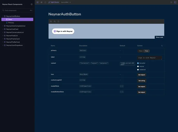
This SDK is particularly beneficial for developers looking to enhance their applications with seamless user authentication and interaction features. By offering components like the NeynarAuthButton and NeynarProfileCard, it enables straightforward integration for functionality such as user sign-ins and profile displays.
NeynarAuthButton: Easily embed a “Sign In With Neynar” button, allowing for either read-only or full read-write access to users’ Farcaster accounts. Customize the button’s label, icon, and style to fit your app’s design.
NeynarProfileCard: Display user profile information effortlessly with this component. Simply provide the user’s FID to showcase relevant details in a neatly formatted card.
NeynarUserDropdown: A dynamic dropdown component for searching Farcaster users. It allows for customized styles and provides a callback for value changes, enhancing user interaction and search capabilities.
NeynarCastCard: Present individual Farcaster posts elegantly through this component. Support for different identifier types (URL or hash) allows for versatile usage while including options for user interaction like reactions.
Custom Styles: All components support CSS properties for customization, ensuring that developers can maintain consistent branding and visual appeal throughout their applications.
Peer Dependencies: Installation is straightforward with clear guidance to manage peer dependencies, making setup rapid and efficient for developers.
Storybook Compatibility: The SDK facilitates testing components in Storybook, allowing developers to visualize and fine-tune their UX before deploying to production.
Extensive Documentation: Comprehensive guides are available to aid developers in maximizing the SDK’s potential, reducing the onboarding time for new users.