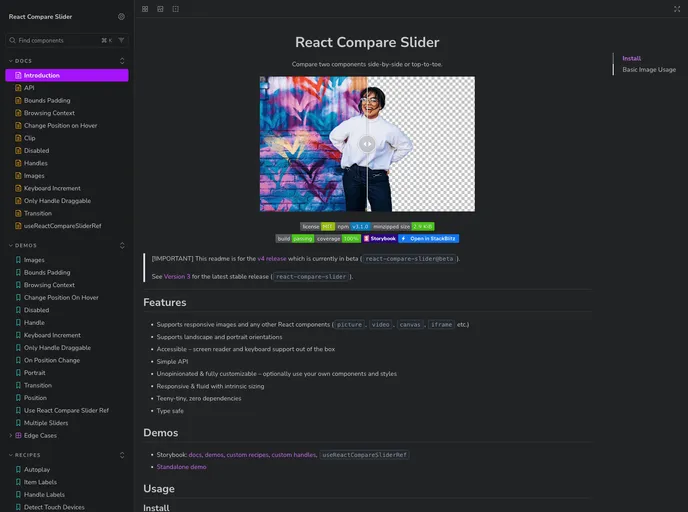
A slider component to compare any two React components in landscape or portrait orientation. It supports custom images, videos... and everything else.
The React Compare Slider is an innovative tool that allows users to effortlessly compare two images or components side by side. Ideal for showcasing before-and-after images, user interfaces, or any visual content, this package is designed to work seamlessly with React applications. Currently in its beta version (v4), it boasts a range of powerful features while maintaining simplicity and accessibility.
As a React developer, I appreciate the versatility and responsiveness that the React Compare Slider offers, granting users the ability to customize and integrate various types of media, making it a fantastic addition to any project focused on visual content comparison.
Supports Responsive Images: Effortlessly display images or other React components, including videos and iframes, ensuring a versatile user experience tailored to any device.
Orientation Flexibility: The slider can handle both landscape and portrait orientations, catering to diverse content types.
Accessibility First: Out of the box, it offers support for screen readers and keyboard navigation, ensuring inclusivity for all users.
Simple API: The straightforward API allows for easy integration and quick setup, making it accessible even for those with limited React experience.
Customization Options: Enjoy an unopinionated and fully customizable approach where you can utilize your components and styles as needed.
Fluid and Responsive Design: Boasting intrinsic sizing, it adapts dynamically to different screen sizes, enhancing usability across devices.
Lightweight: The product is teeny-tiny with zero dependencies, which means minimal impact on application performance.
Type Safe: Built with type safety in mind, ensuring that developers can write reliable and error-free code with ease.