Responsive JSX layouts with Styled Components
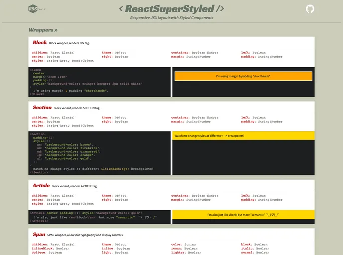
React Super Styled (RSS) is a small React component library designed to accelerate the authoring of JSX layouts and improve their readability. It offers semantic component and prop naming, handy boolean props for common styling rules, media breakpoint support, flexbox and flex-based grid capabilities, spacing “shorthands” for margin and padding, customizable themes and breakpoints, and a highly configurable SVG icon wrapper and utilities. However, RSS may not be suitable for complex components requiring extensive custom styling, ultra dense layouts, tables, recursive or iterative applications, or when maximum performance is critical.
To use React Super Styled, your React project should have Styled Components v4.0+ as a dependency. If it’s not already installed, you can install it by running the following command:
npm install styled-components
Once you have Styled Components installed, you can proceed to install React Super Styled by running the following command:
npm install react-super-styled
React Super Styled is a useful React component library that aims to improve the authoring of JSX layouts by providing semantic component and prop naming, boolean props for common styling rules, media breakpoint support, flexbox and flex-based grid capabilities, spacing “shorthands” for margin and padding, customizable themes and breakpoints, and a highly configurable SVG icon wrapper and utilities. However, it may not be suitable for complex components or applications that require extensive custom styling or maximum performance.