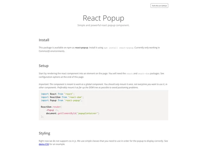
React popup component
React-popup is an innovative approach to managing popup alerts in a React application. With its design intent to act as a drop-in replacement for the native window.alert, it provides developers with a cleaner and more customizable experience. The recent update in version 0.9.x introduces a notable change, separating the popup and overlay into two distinct layers, which greatly enhances customization options.
By utilizing a global API, this component assures that only one popup is displayed at a time, maintaining a user-friendly interaction. The simplicity of installation and the ease of rendering make it an attractive tool for any React developer looking to streamline alert handling in their applications.
Separation of Layers: The popup and overlay are now independent layers, allowing for greater styling and customization options to better fit your UI needs.
Global API Control: Unlike traditional components, react-popup uses a global API, making it straightforward to control the popup without rendering it multiple times in various components.
Single Popup Display: Ensures that only one alert is shown at any given time, providing a clean and non-intrusive user experience.
Easy Installation: You can install react-popup simply using npm or yarn, making it accessible for any project.
API Driven Component: The component is designed to be driven by APIs, meaning you only need to render it once globally in your application.
Demo & Documentation: Comprehensive documentation and demo resources are available, making it easy for developers to get started and understand its usage.