Medly components provides numerous themable react components, each with multiple varitaions of sizes, colors, position etc.
Overview
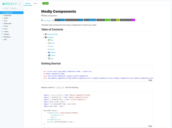
Medly Components is a versatile component library designed for React applications, providing a dynamic and customizable suite of components to streamline your development process. With a focus on modular design, it allows developers to quickly assemble user interfaces that meet their unique needs. Whether you’re building forms, layouts, or incorporating icons, Medly’s offerings cover a broad spectrum of use cases, making it a valuable tool for both novice and experienced developers.
The library is built with modern technologies such as React, TypeScript, and styled-components, facilitating a seamless integration into any project. Equipped with comprehensive documentation, including a Storybook for visualization, Medly Components simplifies the creation of beautiful and functional web applications.
Features
- Core Package: Includes essential components like Avatar, Button, Input, and Modal to kickstart any application.
- Forms Package: Create dynamic forms effortlessly using simple JSON configurations, enhancing user input management.
- Icons Package: Access a collection of commonly used SVG icons that are packaged as React components for easy usage.
- Layout Package: Design page layouts using versatile components, allowing for customized side panels and navigation structures.
- Loaders Package: Utilize simple SVG loaders that are easily integrable into your applications, improving user experience during content loading.
- Markdown Package: Use a straightforward syntax guide to format content efficiently, making text presentation effortless.
- Theme Package: Customize the overall look and feel of components individually, providing flexibility in design aesthetics while maintaining consistency.
- Utils Package: Employ various helpful utility functions, such as string manipulations, that simplify common tasks in development.