React Lightning Design System screenshot

React Lightning Design System

Author Avatar Theme by Mashmatrix
Updated: 7 Aug 2025
256 Stars

Salesforce Lightning Design System components built with React

Overview

The React Lightning Design System is an impressive collection of components designed specifically for use with the Salesforce Lightning Design System. Tailored for seamless integration with React, it simplifies the process of creating visually appealing and functional applications. The toolkit not only enhances productivity but also ensures that your projects maintain a consistent look and feel, reflecting the core design principles of Salesforce.

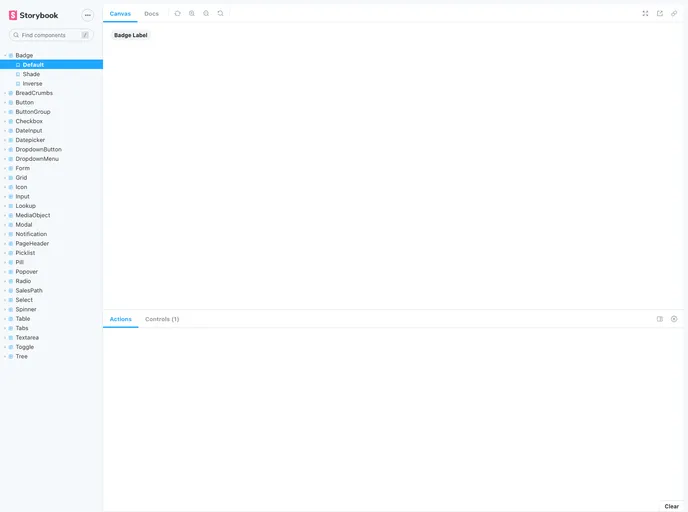
The accompanying documentation is user-friendly, making it easy to set up and start using the components. With useful features like a storybook for demonstrations and comprehensive testing options, developers can feel confident in building and maintaining their applications effectively.

Features

  • Easy Installation: Quickly set up the system with a straightforward npm install command to get all necessary components ready for use.
  • Demo and Examples: Access a variety of examples in the examples directory, showcasing how to implement components in real-world scenarios.
  • Storybook Integration: Built-in React storybook allows developers to run local examples and view components dynamically by using npm run storybook.
  • Snapshot Testing: Supports snapshot testing to track and identify rendering differences efficiently, ensuring that changes remain intentional and manageable.
  • Flexible Running Options: Offers several run options for testing, including interactive mode, which enhances developer productivity and understanding of components.
  • Consistent Design: Ensures adherence to Salesforce’s design principles, promoting a cohesive user experience across applications.
  • Customizable: The components can be easily customized to fit various project requirements without sacrificing their integrity or functionality.