React component for displaying a gauge chart
The react-gauge-chart is an impressive React component designed for creating visually appealing gauge charts using the powerful D3.js library. With its ease of use and flexibility, it’s an ideal choice for developers looking to integrate dynamic data visualization into their applications. The component provides a seamless way to represent data with a gauge-like interface, making it easy for users to interpret information at a glance.
Incorporating this gauge chart into your project is straightforward, allowing for customization to fit specific design needs. Whether you need to show performance metrics, progress tracking, or any percentage-based information, this component can adapt to suit your requirements.
Simple Installation: Installing the gauge chart is as easy as running npm install react-gauge-chart, making it accessible for developers of all skill levels.
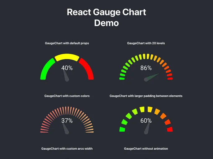
Customizable Appearance: The chart comes with a variety of customizable properties like colors and arc width, allowing you to tailor its look to match your application’s theme.
Flexible Prop Options: It supports a range of props such as nrOfLevels, percent, arcPadding, and more, enabling detailed configuration based on your visualization needs.
Dynamic Updates: While it’s important to note the re-render behavior on prop updates, the ability to set a fixed height offers a workaround for ensuring a consistent display.
Variety of Display Options: You can disable animation, customize corner radius, and adjust the distance between elements to refine the presentation further.
Versatile Usage: Whether you’re creating a simple default chart or a more complex gauge with custom settings, this component can easily handle different scenarios.
Accessible Color Options: It allows for an array of colors in HEX format, ensuring that the gauge is not only functional but also visually appealing.
Text and Needle Customization: Tailor the text color and needle appearance to enhance readability and aesthetic appeal, making your data presentations stand out.