Swipeable list component for React supporting several behaviours (e.g. iOS)
If you are looking to implement swipeable lists in your React application, the React Swipeable List component could be just what you need. This innovative component allows you to create lists with items that can be swiped to reveal various actions, enhancing user interaction while maintaining a sleek design. With its recent upgrades, this component has improved functionality and customization options that really elevate the user experience.
Designed with flexibility in mind, new features mean you can tailor the behavior of swipeable items according to your needs. Whether you’re aiming for a simple list or something more complex with multiple actions, this component adapts to fit right in.
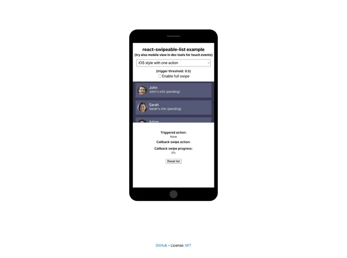
Customizable Swipe Actions: Users can swipe left or right to reveal one or more actions tailored to their needs, enhancing interactivity.
Full Swipe Option: A boolean prop allows for different swipe behaviors on iOS devices; actions can be triggered simply by swiping or must be clicked.
Timing Control: With configurable settings for action delay and destructive callback delay, you can fine-tune how quickly actions are triggered after a swipe.
Style Flexibility: Option to add additional styles for the list tag, allowing you to seamlessly integrate the component with your app’s design.
Cross-Platform Support: Compatibility with multiple platforms such as Android, iOS, and MS, ensuring a consistent experience across devices.
Scroll and Swipe Thresholds: Adjustable thresholds for starting swipes and blocking swiping during scrolling, providing control over the user interaction experience.
Tag Customization: The ability to choose the HTML tag used for the component, giving developers more control over semantics and accessibility.
Detailed Props Management: Specifies a range of props at both list and item levels, allowing for granular control over behaviors across various items within the list.