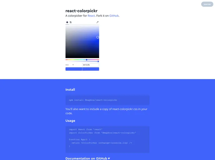
Overview:
The colorpicker for React is a npm package that allows users to implement a colorpicker in their React applications. It provides a user-friendly interface for selecting and manipulating colors.
Features:
- onChange: Calls a function whenever a color is updated from the colorpicker.
- theme: Allows users to override the default theme by providing a custom theme object.
- initialValue: Sets the initial color value of the colorpicker.
- colorSpace: Initializes the default color space (HSL, RGB, or HEX) for the colorpicker.
- mode: Determines which view tab (disc or values) is active by default.
- eyedropper: Adds an eyedropper tool to the interface for selecting colors from the screen.
- reset: Adds a reset button that reverts the colorpicker to the initial color.
- alpha: Provides a range slider and input for adjusting the alpha channel of the color.
- mounted: Allows access to internal methods of the colorpicker component.
- discRadius: Allows customization of the radius of the color selection disc.
- readOnly: Renders the colorpicker in a readonly state, showing values but not allowing user input.
Installation:
To install the colorpicker for React, follow these steps:
- Install the package using npm:
npm install react-colorpickr
- Import the necessary components and CSS file in your code:
import Colorpickr from 'react-colorpickr';
import 'react-colorpickr/dist/colorpickr.css';
- Use the Colorpickr component in your code:
Summary:
The React colorpicker npm package provides an easy-to-use colorpicker component for React applications. It offers various customizable features such as theme customization, color space selection, and alpha channel adjustment. With simple installation steps, it can be quickly integrated into existing React projects.