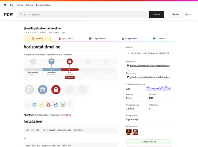
Horizontal timeline component
The Horizontal Timeline is a versatile React component designed for creating visually engaging horizontal timelines with ease. It leverages Material-UI, offering a modern aesthetic and seamless integration with existing applications. With options to customize the appearance and functionality, this component caters to a variety of timeline display needs, from simple event tracking to more complex timeline presentations.
Whether you’re building a project management tool, an event scheduler, or showcasing historical milestones, the Horizontal Timeline provides the flexibility to fit your specific requirements. You can choose different variants for display and even customize individual events for a fully tailored user experience.
Multiple Variants: Choose from default, simple, or small timelines to find the look that best suits your project. Each variant displays events differently to match your design needs.
Dynamic Height Adjustment: Easily set the component height based on the selected variant, ensuring it fits perfectly within your layout.
Event Placeholders: Utilize the minEvents prop to display placeholders when fewer events are available, providing a consistent visual experience.
Color Customization: Set unique colors for events via the color prop, allowing for better branding or categorization of events within the timeline.
Icon Integration: Customize events with specific icons to enhance recognition and engagement, making timelines easier to interpret at a glance.
Actionable Events: Assign actions to events (clickable buttons) or integrate dynamic components like React elements to create interactive timelines.
Limit Event Display: Use the maxEvents prop to control the number of events displayed at one time, perfect for keeping timelines clean and focused.
Rich Text Support: Tailor event titles and subtitles using the titleProps and subtitleProps for advanced typography customizations straight from Material-UI.