Example project showing how to create advanced multi-part components in Chakra UI
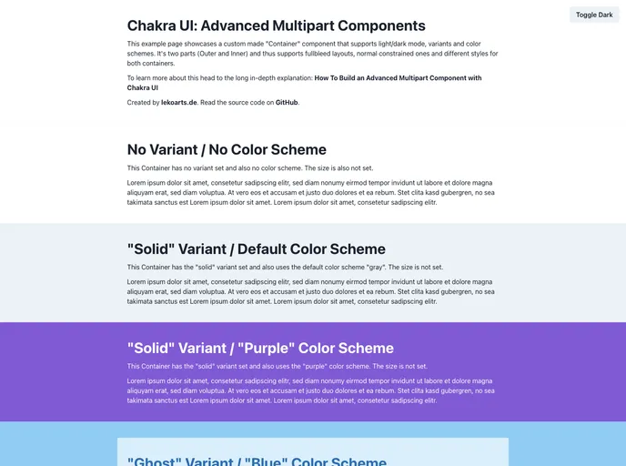
Chakra UI is a powerful UI library that offers advanced multipart components. One such example is the custom-made “Container” component, which provides support for light/dark mode, variants, sizes, and color schemes. This component consists of two parts, the Outer and Inner containers, allowing for flexible and dynamic layouts.
To install Chakra UI and start using the advanced multipart components, follow these steps:
npm install @chakra-ui/react @emotion/react @emotion/styled framer-motion
import { Container, Box } from "@chakra-ui/react";
<Container variant="primary" size="md" bg="gray.200">
  <Box p="4">
    // Inner content here
  </Box>
</Container>
Chakra UI is a UI library that offers advanced multipart components, including the versatile Container component. With features like support for light/dark mode, variant flexibility, and size customization, Chakra UI provides developers with powerful tools to create highly customizable and dynamic user interfaces. While the component style APIs may initially seem complex, Chakra UI’s theming capabilities and advanced examples serve as valuable resources for mastering its usage.