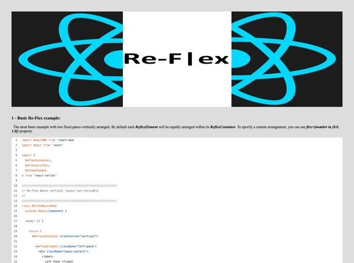
Resizable Flex layout container components for advanced React web applications
Re-F|ex is a versatile React component library designed specifically for flexible layout management in advanced web applications. Created to fill the gap where other libraries fell short, Re-F|ex focuses on providing resizable layouts that can adapt to different user requirements. It’s an ideal solution for developers looking for dynamic and responsive design capabilities without the hassle of complicated configurations.
This library supports various configurations and is thoroughly tested across multiple browsers, making it both robust and reliable. Whether you are building a simple application or a complex user interface, Re-F|ex aims to simplify the layout process while ensuring your components are mobile-friendly and visually appealing.
Flexible Orientation: Choose between horizontal or vertical layout orientations easily with the orientation property.
Maximum Recursion Depth: Prevent infinite loops during layout calculations by setting a maximum recursion depth with maxRecDepth.
Window Resize Awareness: Enable responsive layouts that adapt to window size changes by using the windowResizeAware option.
Custom Class Names: Enhance your component’s styling by applying custom class names through the className property.
Inline Styling: Pass custom inline styles directly to your container using the style property for greater design flexibility.
Dimension Propagation: Control whether or not dimension properties (height, width) should propagate to child components using propagateDimensions.
Performance Tuning: Adjust the update frequency of dimensions when resizing through propagateDimensionsRate to improve performance for heavy components.
Size Constraints: Set constraints for minimum and maximum sizes of the elements through the minSize and maxSize properties, ensuring optimal user experience.