Kubit React Components
 Theme by
Kubit ui
Theme by
Kubit uiUpdated:
10 Oct 2025
|31 Stars
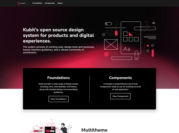
Kubit React Components is a customizable, accessible library of React web components, designed to enhance your application's user experience.
Categories
Overview
The Kubit UI package offers a modern approach for developers looking to enhance their applications with visually appealing and functional components. The installation process is straightforward, allowing you to quickly implement the package’s features. With a focus on simplicity and ease of use, Kubit UI aims to provide a robust set of web components, making it an attractive option for both beginner and experienced developers.
Features
- Easy Installation: Simply run
npm or yarn to install the package along with all its dependencies, getting you started in no time. - Component Usage: Import components seamlessly into your application to leverage default styles and functionality, enhancing the user experience with minimal effort.
- KubitProvider Dependency: Required for utilizing components, it establishes the necessary theme and context, ensuring consistency across your application.
- Comprehensive Documentation: Access detailed documentation on the Kubit UI website, helping you navigate and utilize the components effectively.
- Storybook Integration: Clone the repository and run the storybook to view components in action, enabling quick testing and previewing of UI elements.
- Testing Capabilities: Easily run tests with a simple command to verify the functionality of components and ensure a reliable user experience.
- Contribution Guidelines: Engage with the project by following clear steps for contributing, making it easy to get involved and improve the package.
- Automatic Version Control: Enjoy an advanced publishing system that automatically manages version bumps based on branch naming patterns, streamlining your development workflow.