디지털 정부서비스 UI/UX 가이드라인의 React 라이브러리입니다.
Overview
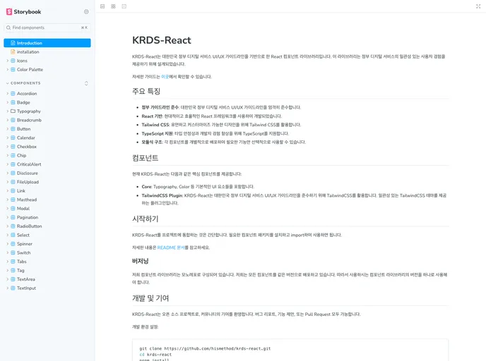
KRDS-React is a cutting-edge React component library developed in accordance with the South Korean government’s digital service UI/UX guidelines. Its primary aim is to provide a consistent user experience across government digital services, making it an essential tool for developers focused on enhancing public sector digital interfaces.
This library not only ensures adherence to established design standards but also incorporates modern technologies such as TailwindCSS and TypeScript. By utilizing KRDS-React, developers can create visually appealing and user-friendly applications that resonate with the principles of efficiency and accessibility.
Features
- Government Compliance: Fully adheres to South Korea’s digital service UI/UX guidelines, ensuring a standardized user experience.
- Reusable Components: Offers a variety of reusable UI components based on React and TailwindCSS, enabling efficient development.
- TypeScript Support: Designed with TypeScript compatibility to enhance code quality and provide better developer experiences.
- Component Documentation: Features comprehensive documentation for components through Storybook, facilitating easier integration and usage.
- Core Components: Provides essential core components such as typography and color, which serve as foundational elements for building interfaces.
- TailwindCSS Plugin: Includes a plugin that delivers a cohesive TailwindCSS theme in line with government design standards.
- Community Contributions: Encourages collaboration through open-source contributions, allowing developers to report issues, suggest features, and submit pull requests.