Selection based Text UI made easy
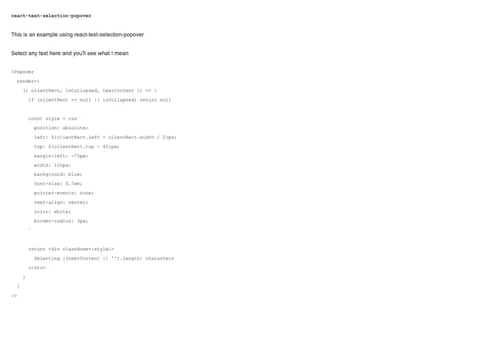
The react-text-selection-popover is a powerful React component designed to enhance user interactions by displaying a popover that aligns perfectly with the current text selection. This utility is particularly useful for applications that require contextual actions or information based on highlighted text, making it an excellent addition for developers seeking to improve user experience. By utilizing React Portals, the popover is both versatile and easy to integrate into existing projects.
This component not only streamlines the way users interact with selected text but also provides flexibility for developers through its customizable render props. The ability to define how the popover appears next to selected text adds an engaging layer to web applications, allowing for a more dynamic and responsive design.
Custom Render Prop: The popover can be rendered through a provided function, allowing full customization of the popover’s content and appearance based on the context.
Portals Support: Utilizes React Portals to ensure that the popover is rendered outside of the regular DOM hierarchy, preventing styling issues and ensuring it appears where intended.
Dynamic Positioning: The popover’s position is dynamically calculated based on the selected text, ensuring it is always in the correct location relative to the user’s selection.
Mounting Flexibility: Developers can specify a DOM element for mounting the popover, giving options for better control over where it appears in the DOM structure.
Text Selection Aware: Designed specifically to work in conjunction with text selection, ensuring the popover only activates when necessary.
Compatibility: Built to work seamlessly with existing React applications, making it a straightforward integration for any JavaScript project.