React UI components built with a focus on accessibility, customization and ease-of-use
Overview
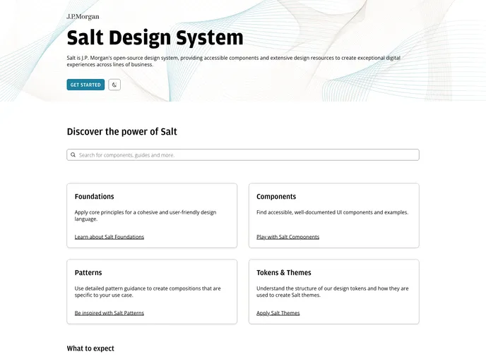
Salt is an innovative suite of UI components designed for modern web development, offering a comprehensive theming system that allows for both default and customizable themes. With its appealing aesthetics, available in light and dark modes, Salt not only meets the visual demands of contemporary applications but also provides support for various UI densities. The framework emphasizes performance and accessibility by adhering to WCAG 2.1 guidelines, ensuring that your applications are not only beautiful but also user-friendly for everyone.
What’s particularly compelling about Salt is its modular architecture; it comprises several packages that cater to different needs, ensuring a lightweight and efficient development process. Whether you’re looking for stable components, in-development features, or stylish icons, Salt has you covered.
Features
- Comprehensive UI Controls: Offers a wide range of commonly-used controls for seamless application development.
- Flexible Theming System: Easily create multiple theme variations or substitute alternate themes to match your brand identity.
- Dark and Light Variants: Choose between aesthetically pleasing light and dark themes to enhance user experience.
- Accessibility Compliance: Fully compliant with WCAG 2.1 standards, ensuring your applications are accessible to all users.
- Lightweight and Performant: Designed to maintain high performance while keeping your application size manageable.
- Minimal Third-party Dependencies: Reduces bloat and potential compatibility issues by minimizing reliance on external libraries.
- Active Development Environment: Utilize beta components from the @salt-ds/lab package to stay ahead with new features before they stabilize.
- SVG-based Icons: Access a collection of scalable icons to enhance your application’s visual appeal and interface clarity.