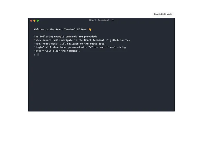
A terminal React component with support for light and dark modes.
The React Terminal UI is a versatile terminal component designed for use in React applications. With the ability to support both light and dark themes, it caters to different user preferences and enhances the overall aesthetic of your application. This component is not only visually appealing but also highly customizable, making it an invaluable tool for developers looking to integrate terminal-like functionality seamlessly.
This component operates as a “dumb component,” meaning it renders whatever props are passed to it without managing internal state. This flexibility allows developers to create a unique controller component to handle the terminal’s state, enabling more complex interactions and functionality.
Customizable Name: Display any desired name at the top of the terminal, allowing personalization per the application’s theme.
Light and Dark Modes: Switch easily between light and dark color modes to match user preferences or application design.
Input Handling: An optional onInput callback function lets developers capture user input when the Enter key is pressed, enhancing interactivity.
Dynamic Starting Input: Set a starting input value that can change dynamically, making it easy to reset or pre-fill the user’s input.
Custom Prompt Character: Change the prompt character from the default $ to something else, tailoring the terminal experience to fit the application context.
Adjustable Height: Configure the terminal height easily, with a default setting of 600px, ensuring it fits well within the application’s layout.
Callback Functions for Interactions: Provide optional callback functions for the red and yellow buttons, enabling custom actions when these buttons are clicked.