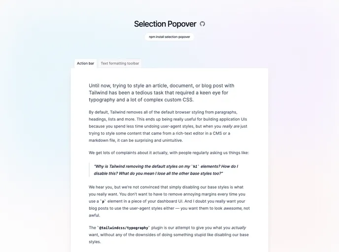
Easy-to-use, unstyled, composable react selection popover.
The npm version of this product presents a powerful tool for developers looking to enhance the functionality of their applications. With features that focus on user interaction, like popups and selection-aware animations, it streamlines the process of creating engaging user interfaces. The library integrates smoothly with existing frameworks and is particularly useful for implementing features such as tooltips or contextual menus without compromising performance or usability.
These features not only make it easy to provide additional content without clutter but also ensure that the user experience remains intuitive and responsive. By correctly handling various states and events, this tool helps developers create dynamic applications that react to user actions in meaningful ways.
Default Open State: The popover can be initialized in an open state, which is particularly useful for situations where you want to show information right away without user interaction.
Controlled Open State: Developers have the ability to control when the popover is active, allowing for more dynamic interactions based on user actions.
Selection Awareness: The popover can automatically open while text is selected, providing context-sensitive information that enhances user experience without requiring additional clicks.
Disabling Capability: There’s an option to disable the popover when text is selected, offering complete control over user interaction and behavior.
Open and Close Delay: Customizable delays for opening and closing the popover make interactions feel smoother and more refined, allowing for better user engagement.
Trigger Element Flexibility: The component allows wrapping around custom HTML tags or components, letting developers easily integrate it into their existing projects while maintaining styling and behavior.
Content Portability: The ability to use portals means that content can be placed exactly where needed in the DOM, regardless of the component hierarchy, ensuring proper placement and visibility.
This combination of features showcases the versatility and effectiveness of the tool, making it a strong choice for developers aiming to improve their applications.