Simple accessible React dropdown component. Checkout demo:
If you’re in search of a lightweight and accessible dropdown component for your React applications, look no further than react-dropdown-aria. Designed with performance and usability in mind, this package elegantly combines the ease of integration with powerful features. Drawing inspiration from the highly regarded react-select, this component emphasizes customization and accessibility, making it a go-to choice for developers who want to enhance user interactions without compromising on accessibility standards.
The transition from version 2 to version 3 introduces significant improvements, and understanding these changes is crucial for a smooth upgrade. With proper documentation and examples available, getting started with this component is a breeze, allowing developers to focus more on building great applications and less on troubleshooting.
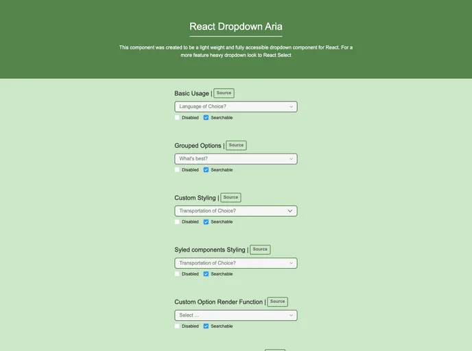
Fully Customizable Styling: Leverage styled-components for tailor-made designs that fit your application’s unique aesthetic.
Grouped Options: Easily implement dropdowns that categorize choices, providing a clearer interface for users.
Accessible: Designed to meet accessibility standards, ensuring that all users, including those with disabilities, can navigate your dropdowns.
Searchable: Users can quickly find options in the dropdown, enhancing the overall user experience.
Custom Render Function: Allows developers to utilize custom render functions for dropdown items, adding flexibility to how options are displayed.
TypeScript Support: Built-in typings for TypeScript make it easier to integrate into projects that leverage this powerful typing system.
Peer Dependencies: The component is compatible with styled-components, ensuring seamless styling capabilities.
Simple Installation: Quickly add the package to your project using npm or yarn, making it accessible to anyone ready to enhance their React applications.