Integrate Semantic-ui with react components.
Overview
React-Semantify is a valuable library that integrates Semantic-UI with React components, filling a gap until the official Semantic-UI-React library reaches its full release. With the evolving landscape of React and its component ecosystems, React-Semantify allows developers to harness the styling capabilities of Semantic-UI while building React applications. It’s an effective solution for developers looking to keep their projects up-to-date with the latest React features while utilizing familiar UI patterns from Semantic-UI.
As the official library is still in development, React-Semantify serves as a bridge, enabling continued usage of Semantic-UI styles and components in React-based projects. Feedback and suggestions for improvements are encouraged, fostering a sense of community around its use.
Features
- Seamless Integration: Easily combine Semantic-UI’s styling with React components to create visually appealing applications.
- Dependency Friendly: Requires jQuery, Semantic-UI, React, and ReactDOM, allowing for flexible integration into existing projects.
- Pre-release Components: Offers a variety of pre-release components like Buttons, Modals, and Grid layouts, allowing early adopters to experiment.
- Customizable: The library supports various versions of React, ensuring compatibility across multiple setups.
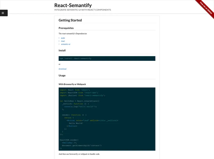
- Simple Usage in Browsers: Users can easily integrate the library by including dependencies directly in HTML or using modern tools like Browserify or Webpack.
- Community-Driven: Encourages contributions and feedback as it evolves, fostering a collaborative environment among developers.
- License: Released under the MIT license, promoting open-source use and modification.
- Documentation: Includes documentation for components, enhancing usability and facilitating onboarding for new developers.