Overview
The React implementation for the Figma Plugin Design System by Tom Lowry is a powerful tool that seamlessly integrates the aesthetics of Figma with React components. It provides developers and designers with a cohesive way to create user interfaces, enabling them to leverage the power of React while maintaining the style and consistency of Figma’s design language. With this library, you can easily build UI elements that are not only functional but also visually appealing.
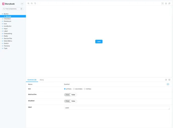
Whether you’re developing a complex application or a simple interface, this library simplifies the installation and usage of various UI components such as buttons, checkboxes, and more. The integration with tools like Storybook further enhances the experience by allowing you to interactively explore components and see how they can be customized.
Features
- Easy Installation: Quickly install the library in your project using npm or Yarn, making it accessible right from the start.
- Comprehensive Component Library: Includes a variety of components such as buttons, checkboxes, and disclosure panels to cover multiple UI needs.
- Button Variants: Offers different styles for buttons, including primary, secondary, and tertiary options to fit your design requirements.
- Destructive Actions: Support for a red destructive variant in buttons, suitable for critical actions like deletions.
- Unique IDs for Checkboxes: Ensures each checkbox has a unique ID, preventing conflicts and improving accessibility.
- Disclosure Panels: Easily implement disclosure panels to manage content visibility with hierarchical structure, with customizable render items.
- Customizable Props: Components come with dedicated props, allowing customization of container and label elements for a more tailored look.
- Interactive Playground: Utilize Storybook for a live demo environment to preview and interact with components before integrating them into your project.