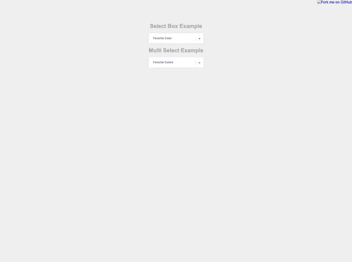
An accessible select box component for React.
Overview
The React Select Box is a highly accessible component designed to provide users with an efficient way to select items within a React application. It simplifies the selection process while ensuring that all users, including those utilizing assistive technologies, have full functionality. This component is particularly useful for developers looking to enhance the user experience in their React projects.
With its easy installation and robust functionality, the React Select Box helps streamline form elements and make them more interactive. It has been designed with best practices in mind, ensuring that it not only meets accessibility standards but also offers a seamless integration into diverse projects.
Features
- Accessibility Focused: Built with ARIA support, the React Select Box ensures all users can interact with the component effortlessly.
- Easy Installation: Simply add the component to your project through straightforward installation steps to get started quickly.
- Customizable Options: The component allows developers to easily customize options to fit the needs of their application, whether in style or functionality.
- Event Handling: Includes robust event management features that allow users to manage actions effectively when selections are made.
- Development Testing: Comes with built-in testing functionalities to ensure the component performs as expected during development.
- Dev Server Support: Automatically runs on port 1337 for convenience, allowing for quick local development and testing.
- Demo Available: A live demo showcases the component’s capabilities, making it easier for developers to visualize its implementation.