Filtered multi-select React component
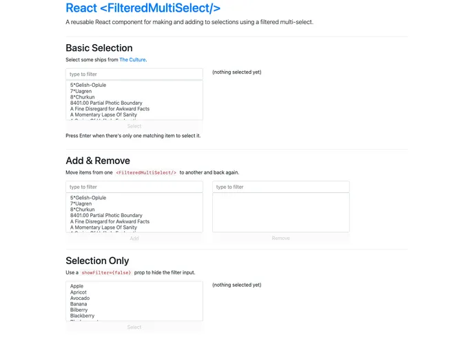
The <FilteredMultiSelect/> React component is designed to simplify the process of selecting multiple options from a filtered dropdown list. It seamlessly integrates with Bootstrap for styling and offers a user-friendly experience when dealing with large datasets. With its live filtering capabilities, users can quickly find what they need without the hassle of scrolling through long lists. This component not only manages selections efficiently but also ensures responsiveness through a straightforward API.
Live Filtering: As users type in the input, the select options are filtered in real time, displaying only those that match the entered text.
Dynamic Button Enabling: The button for making selections becomes enabled automatically when there are selected options, encouraging interaction.
Single Selection Shortcut: If one option remains after filtering, simply pressing Enter in the input will swiftly select that item for the user.
Custom OnChange Callback: Whenever selections change, the component triggers an onChange callback to handle the current selected options, keeping your application state synchronized.
Hide Selected Items: By utilizing the selectedOptions prop, already selected items can be hidden from the dropdown, streamlining the selection process.
Removal and Deselecting Options: Users can easily deselect items by adjusting the input to remove selected options and re-render the component.
Flexible Configuration: The component allows for customization through props like buttonText, className, and default filter text, making it adaptable for different use cases.
Global Availability: The component can be bundled for browser use, creating a global FilteredMultiSelect variable for easy access within any application that has React loaded.