Overview
The React component library built on Vite, designed for toy projects, offers a modern and efficient approach to building user interfaces. Its seamless integration with tools like TypeScript, SCSS, and CSS Modules makes it a great choice for developers looking to create visually appealing and functionally robust applications. With a focus on user interaction and minimal impact on external state, this library provides a solid foundation for building interactive components.
Features
- Internal State Rendering: Components that receive user input can manage their internal state, allowing for rendering at the component level without disrupting external state values.
- Intrinsic Validation Support: The library provides convenient Higher-Order Components (HOCs) and hooks like
validationObserver and useValidation for effective input validation without impacting external state. - Dark Mode Compatibility: Designed to support dark mode, it automatically follows the device’s settings, and developers can easily switch themes using the HTML class value.
- Modern Architecture: Utilizing Vite, this library benefits from fast build times and efficient hot module replacement, enhancing the development experience.
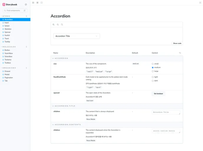
- Comprehensive Documentation: Detailed usage instructions and examples are available, making it easier to grasp the library’s capabilities through Storybook.