Overview:
Hixme-ui is a React component library designed to support the Hixme ecosystem, offering a range of pre-built components that can be easily integrated into projects. With Hixme-ui, developers can enhance their user interfaces by leveraging ready-to-use components built with React, Styled Components, and Jest. This library aims to simplify the development process and provide consistent design patterns for users.
Features:
- Animate: Smooth and customizable animation effects for elements on the webpage.
- App Layout: A layout component that provides a consistent structure for web application pages.
- Benefit Price: A component for displaying pricing information related to benefits.
- BulletList: A component for displaying information in a bullet-list format.
- Button: Various button styles and sizes to suit different needs.
- Card Drawer: A card component that slides out to reveal additional content.
- Card: A customizable card component for displaying information or data.
- Checkbox: A component for checkboxes with customizable styles.
- Close Button: A small button for closing or dismissing elements.
- Container: A container component that wraps other components and provides a spacing system.
- Content Container: A container component for holding content with customizable styles.
- Currency: A component for formatting currency values.
- Dates: A utility component for handling date formatting and display.
- Email: A component for inputting email addresses with validation.
- Form Components: A collection of form-related components for input fields, checkboxes, radio buttons, and more.
- Form Group: A component for grouping related form elements.
- Icon: A library of icons that can be easily integrated into projects.
- InputLabel: A component for displaying labels for form elements.
- Modal: A reusable dialog component for displaying content in a modal window.
- Percentage: A component for displaying percentages with custom formatting.
- Phone: A component for inputting phone numbers with validation.
- Placeholder: A component for generating placeholder text or images.
- Price: A component for displaying prices or amounts with custom formatting.
- Print: A utility component for printing content.
- Radio Button: A component for radio buttons with customizable styles.
- Select: A customizable dropdown select component.
- Separator: A simple horizontal line component for visually separating content.
- Sidebar: A side navigation panel component for organizing content or menus.
- Social Security: A component for inputting social security numbers with validation.
- Step: A component for creating step-by-step progress indicators.
- Table: A flexible and customizable table component for displaying tabular data.
- Tabs: A component for creating tabbed interfaces.
- Text: A component for displaying styled text.
- Title: A component for displaying titles or headings with customizable styles.
- Toggle: A switch-like component for toggling between states.
- Upload Box: A component for uploading files.
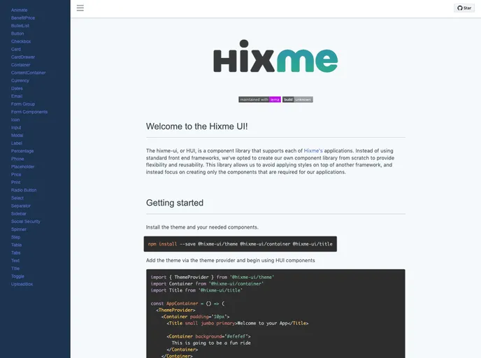
Installation:
To start using Hixme-ui in your project, follow the steps below:
- Install the theme and required components by running the following command:
- Import the theme provider and the necessary components into your project:
import { ThemeProvider } from 'styled-components';
import { Button, Card, Checkbox } from 'hixme-ui';
- Wrap your application with the theme provider component to enable the HUI components to access the theme:
const App = () => (
  <ThemeProvider theme={theme}>
    {/* Your application components */}
  </ThemeProvider>
);
- Start using the HUI components in your application, for example:
const MyComponent = () => (
  <div>
    <Button primary>Click me!</Button>
    <Card>
      <Checkbox label="Check me" />
    </Card>
  </div>
);
Summary:
Hixme-ui is a React component library that offers a comprehensive set of components designed to enhance user interfaces. It simplifies the development process by providing ready-to-use components that can be easily integrated into projects. With Hixme-ui, developers can quickly create interactive and visually appealing web applications while maintaining a consistent design pattern. By leveraging technologies such as React, Styled Components, and Jest, Hixme-ui ensures high-quality and performant components for building modern web applications.