React Components Library
Flamingo is an innovative React component library designed for web applications, developed by Heetch. Built using styled-components, it provides developers with a robust set of tools to create visually appealing and highly functional user interfaces. The library streamlines the process of implementing and customizing components, making it an excellent choice for both seasoned developers and those new to React.
With its focus on simplicity and efficiency, Flamingo supports a collaborative workflow for building new components, adding icons, and managing versioning for easy maintenance. Its comprehensive documentation provides clear guidance, enhancing the developer experience and promoting best practices.
React Component Library: Perfectly built for React, allowing easy integration and use in web applications.
Styled-Components: Utilizes styled-components to manage CSS, making it easier to customize components without the hassle of traditional stylesheet management.
Easy Component Creation: Simple structure for adding new components, enabling rapid development with a well-defined folder organization.
Version Control: Clear versioning system (Major.Minor.Patch) simplifies tracking changes and updates to the library.
Icon Management: Straightforward process for adding new icons through SVG files, automatically updating the icon library.
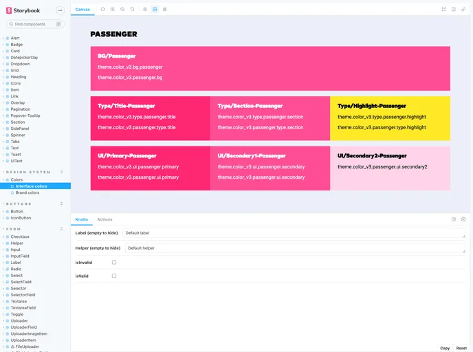
Documentation and Storybook: Comprehensive resources available in a Storybook format to visually demonstrate all components and their functionalities.
Cloudflare Integration: Each pull request is automatically deployed on Cloudflare, providing a unique URL for testing and review.
MIT License: Open-source licensing ensures that developers can use and modify the library freely for their projects.