React components for displaying HL7 FHIR data using Material-UI
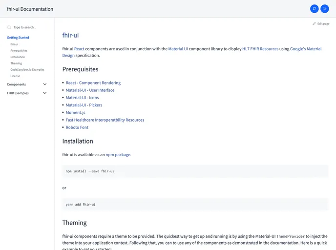
The fhir-ui library is an invaluable tool for developers looking to integrate HL7 FHIR resources within their applications using React. Built specifically to complement the Material UI component library, it allows for the seamless incorporation of healthcare data while adhering to Google’s Material Design specifications. This makes it an excellent choice for anyone in the healthcare tech space who requires an intuitive and polished user interface.
With fhir-ui, developers can focus on delivering robust health applications without getting bogged down in the intricacies of UI design. The library streamlines the process by providing pre-built components that can be easily customized and embedded into existing projects.
Integration with Material UI: Effortlessly combines fhir-ui with Material UI, leveraging the powerful design framework for a consistent user experience.
Comprehensive Component Library: Offers a wide range of pre-built components like Patient Card, Patient Table, and Observation Table, allowing developers to display various FHIR resources easily.
Flexible Theming: Utilizes Material-UI’s ThemeProvider to facilitate custom theming, enabling developers to align components with their brand identity.
Efficient Rendering: Built with React in mind, ensuring that components render quickly and efficiently for an optimal user experience.
Documentation and Examples: Comprehensive documentation and CodeSandbox.io examples make it easy for developers to get started and find practical applications for each component.
Licensed under MIT: The project is open-source and licensed under the MIT license, promoting widespread use and collaboration within the developer community.