Precise Figma & React components. Packed with best practices, unified prop names & consistent design and code.
Functional UI Kit is a design system specifically tailored for product design and development teams and individuals. It offers a range of core components that are necessary for any project and places a strong emphasis on accessibility, developer experience, and a seamless designer-developer workflow.
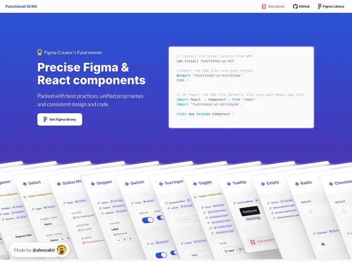
To get started with Functional UI Kit, follow these steps:
npm install functional-ui-kit
@import 'path/to/functional-ui-kit.css';
Alternatively, you can directly import the CSS file into your main React App file.
Functional UI Kit is a powerful design system that caters to the needs of product design and development teams. Its seamless integration of Figma and CSS variables ensures a unified and efficient workflow. With customizable themes and a comprehensive set of components, Functional UI Kit provides the necessary tools for creating accessible and visually compelling projects.