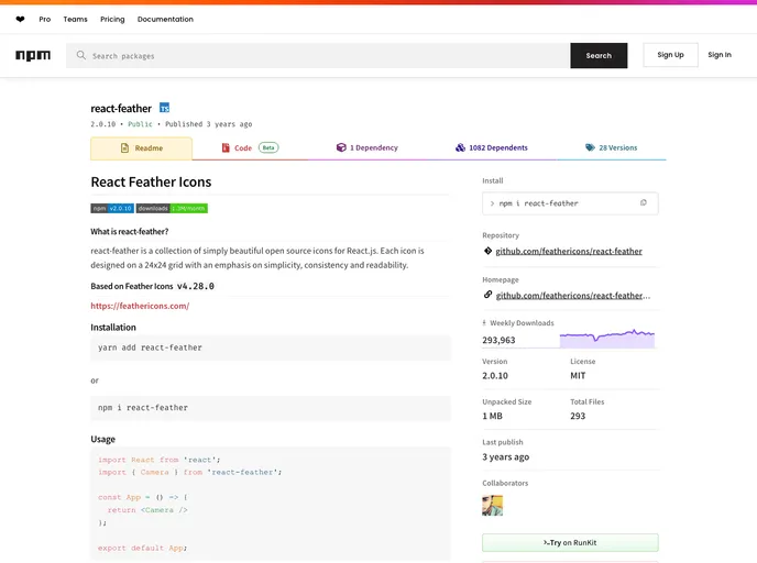
React component for Feather icons
React Feather is a delightful collection of open-source icons designed specifically for React.js applications. With each icon crafted on a 24x24 grid, these icons prioritize simplicity, consistency, and readability, making them elegant choices for modern web projects. React Feather leverages the design principles of Feather Icons v4.29.0, ensuring that developers are equipped with clean, minimalist icons that enhance user interfaces without overwhelming them.
Whether you are looking to enhance your application’s visual appeal or need functional icons for better user interaction, React Feather offers unpretentious yet effective designs. Easy to integrate and versatile in their deployment, these icons cater to a wide range of design needs, allowing developers to focus on functionality while maintaining aesthetic beauty.
Simplicity in Design: Each icon is thoughtfully designed to be minimalistic, ensuring clarity and effectiveness in communication.
24x24 Grid: Icons are consistently sized, adhering to a 24x24 grid, which helps maintain uniformity across your design.
Ease of Integration: The icons can easily be added to your project using inline props, making setup a breeze for developers.
Open Source: Being open-source allows for broad usage and encourages contributions from the community, ensuring constant improvement and updates.
Flexible Usage: For those unable to use ES6 imports, there’s a straightforward option to utilize the compiled icons from the ./dist folder.
Whole Icon Pack Access: You have the option to include the entire icon collection, facilitating broader design choices right out of the box.
Consistent Styling: With a common design language, these icons look cohesive regardless of the context in which they are used.
Choosing React Feather means embracing clean design and high functionality without the bloat often associated with graphic elements.