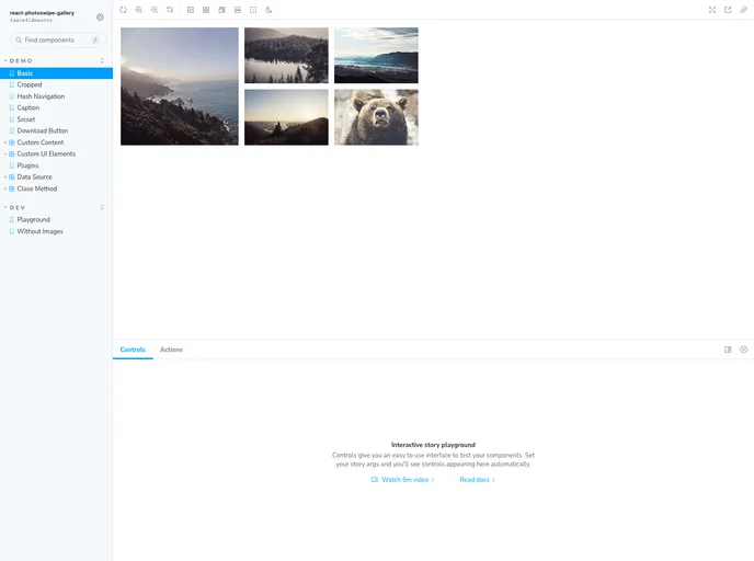
React component wrapper around PhotoSwipe
React-PhotoSwipe-Gallery is a powerful and flexible React component designed to simplify the integration of the popular PhotoSwipe image gallery into your React applications. The component is currently compatible with PhotoSwipe v5, making it a robust choice for developers looking to enhance their projects with a dynamic and feature-rich photo browsing experience. Whether you’re showcasing a portfolio, an e-commerce gallery, or simply a collection of images, this wrapper offers ample customization options to fit your needs.
With its thoughtful design and array of configuration features, React-PhotoSwipe-Gallery empowers developers to create engaging and interactive image galleries. It’s an excellent tool for those who want to leverage the full potential of PhotoSwipe while utilizing the benefits of React’s component-based architecture.
Hash Navigation: Facilitates unique ID props for each <Gallery /> component, enabling seamless navigation with hash links.
Captions Support: Easily add captions to your images with the withCaption prop and customize each caption using HTML.
Plugin Compatibility: Leverage existing PhotoSwipe plugins with the plugins prop, allowing for extended functionalities like dynamic captions.
Custom UI Elements: Personalize the gallery’s interface by incorporating custom UI components through the uiElements prop.
Custom Slide Content: Utilize the content and html props to insert tailored slide content for a uniquely engaging viewer experience.
Versatile Data Source: Use the dataSource prop to manage slides efficiently, rendering thumbnails and full images from a single source.
Instance Access: Gain direct access to the PhotoSwipe instance through onOpen and onBeforeOpen props, facilitating event subscription and method invocation.
Customization Options: Tailor PhotoSwipe settings and styling with the options prop for a personalized gallery experience.