Overview
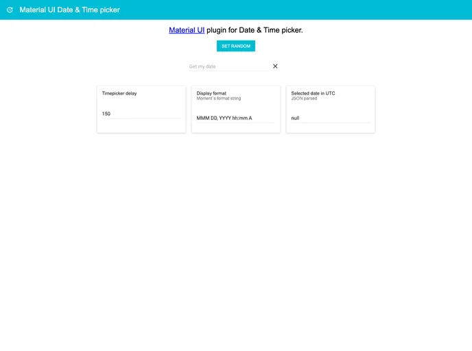
The Material UI Date & Time Picker offers a seamless integration with Material UI components, allowing developers to efficiently manage date and time selections within their applications. Although it is now deprecated, its functionality serves as a foundational tool for anyone working with Material UI, particularly in scenarios where cohesive design and usability are paramount. Migrating to newer versions of Material UI and utilizing material-ui-pickers can enhance your application’s performance and user experience.
Features
- Streamlined Integration: Combines date and time pickers into one cohesive component, making it easier for users to select both attributes without additional clicks.
- Dialog Handling: Utilizes a responsive dialog system that presents pickers one at a time, ensuring a streamlined user interaction.
- Customization Support: Supports all standard Material UI Text Field properties, allowing for personalized styling and adjustments to fit your design needs.
- Dependency Requirement: Designed to be used specifically with Material UI, ensuring it leverages the full capabilities of the library for optimal results.
- Best Practices Recommendation: Encourages developers to implement a custom wrapper to manage props, promoting cleaner code and easier maintenance.
- Community Contribution: Open for contributions, fostering a collaborative environment for improving and expanding functionalities.
- MIT Licensing: Clearly stated licensing under the MIT terms for straightforward usage and redistribution considerations.