Accessible react accordion component
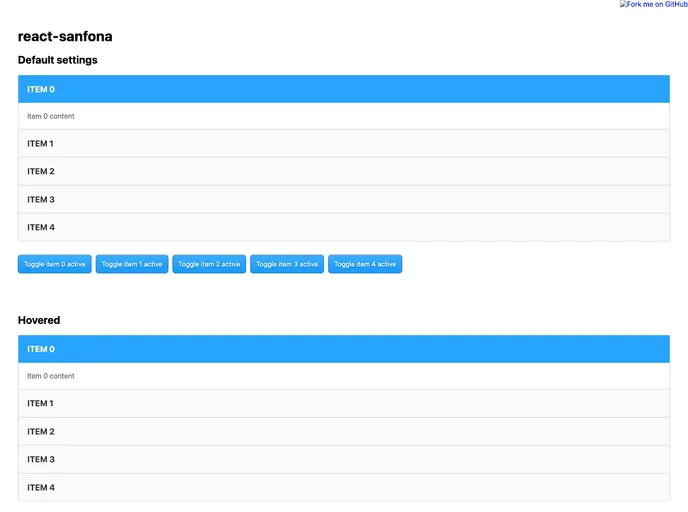
If you’re looking to implement an accordion style component in your React project, react-sanfona might just be the perfect solution. This library offers a simple and efficient way to create collapsible panels, enhancing user interaction without requiring extensive coding. Whether you need to present FAQs, product features, or any nested content, react-sanfona provides a clean and flexible approach to achieve this functionality.
With its customizable features and elegant design, react-sanfona stands out in the sea of React components. It’s designed to offer developers ease of use while ensuring that the end-user experiences a seamless and engaging interface.
Allow Multiple Items: Supports the opening of multiple accordion items simultaneously, giving users the flexibility to view more than one section at a time.
Hover Expansion: Allows you to set up an interaction where accordion items expand when the mouse hovers over them, which enhances the usability and interactivity of your UI.
Dynamic Item Opening: Automatically opens the next accordion item when the previous one is closed, ensuring a fluid transition and user experience.
Custom Styling Options: Offers options for applying custom class names and inline styles, making it easy to integrate the component into your existing design quickly.
Callback Functions: Trigger functions during state changes for more control, perfect for scenarios where you need to perform actions when items expand or close.
Transition Settings: Configurable open/close transition duration and easing functions allowing for smoother animations in line with your project’s design requirements.
HTML Tag Customization: Flexibility to customize the HTML elements used for the root, title, and body of the accordion, enabling better semantics and accessibility.
Disabling Items: Provides an option to disable specific accordion items, giving developers control over item availability based on context or user permissions.