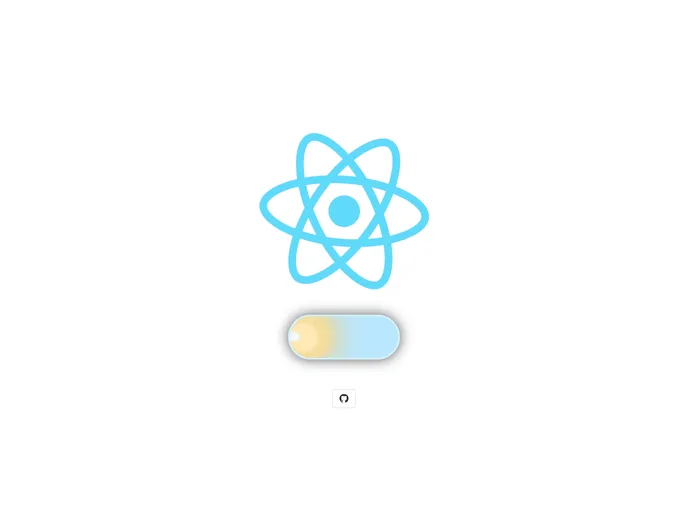
Day & Night (light/dark) theme switch with pretty cool animation for React.
The React Day & Night Toggle is an innovative component that allows developers to easily implement a light/dark theme switch in their applications. With its charming animations and user-friendly design, this toggle enhances the UI experience, enabling users to seamlessly transition between themes. It pulls inspiration from Da_Woodhead’s CodePen, offering a polished and well-documented solution for theme management in React.
This component not only provides functionality but also adds a visual appeal with smooth animations that engage users during the theme switch. Whether you’re looking to brighten up your app or tone it down for a darker aesthetic, this toggle has you covered.
Easy Installation: Available via npm and yarn, getting started is a breeze with simple installation commands.
Customizable Size: Adjust the button size with an integer value, ensuring that it fits perfectly within your design.
State Control: The toggle accepts an onChange prop for handling changes, allowing you to set the state effectively upon user interaction.
Initial Disable State: The startInactive prop disables the button for 2 seconds post-render, preventing theme changes during the loading of styles.
Animation Control: With animationInactive, the button can be disabled during its animation, providing a smoother user experience without accidental switches.
Dynamic Shadows: The toggle casts shadows that change according to day or night modes, enhancing visual depth in the UI.
Custom Class Names: Utilize the className prop to apply your own styles and maintain consistency with your application’s look and feel.
The React Day & Night Toggle combines functionality and aesthetics, making it a valuable addition to any developer’s toolkit for creating immersive user experiences.