Reusable React components built in "Creating Reusable React Components" on Pluralsight
If you’re diving into React and looking to streamline your development process, the Pluralsight React Components library is a remarkable resource. Created as part of the “Creating Reusable React Components” course, this library not only showcases various components but also encourages collaboration within the developer community. With a rich assortment of applications—from recipe sites to chatbots—this library serves as a solid foundation for both new and experienced developers.
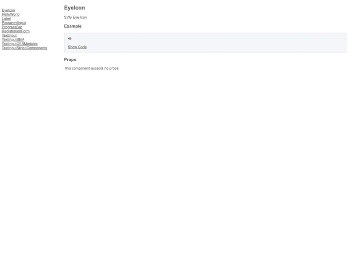
Expect to find a blend of essential features, component documentation, and contributions from fellow developers that enhance the overall capability of your React projects. It’s a great way to expand your knowledge while utilizing pre-built elements to reduce redundant coding efforts.
Extensive Component Library: Offers a wide variety of reusable components suitable for various applications, such as recipes, chatbots, and more.
Community Contributions: Encourages developers to share their own components, fostering a sense of community and collaboration.
Comprehensive Documentation: Each component comes with detailed documentation, making it easy to understand how to implement them in your projects.
Popular Component Integrations: Includes links to popular React component libraries like Material UI and React Bootstrap, allowing for quick access to more resources.
User-Friendly: Tailored for developers at different skill levels, the components are designed to be easily integrated into existing projects.
Flexbox Grid Support: Offers a specialized set of components that apply flexbox grid classes for enhanced layout control.
Active Development: Maintained with regular updates, ensuring that components meet current web standards and use cases.
Engagement with Course Learners: Features a “Component Hall of Fame” that celebrates the contributions of course participants, adding a personal touch to the learning experience.