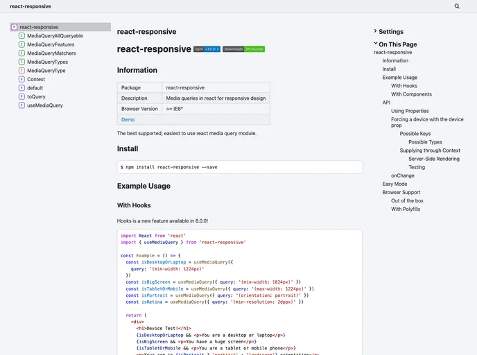
CSS media queries in react - for responsive design, and more.
React Responsive is a powerful tool that simplifies the implementation of responsive design by leveraging CSS media queries directly within React components. This library allows developers to create fluid, adaptive layouts that adjust seamlessly across multiple screen sizes, ensuring that the user experience is consistent and visually appealing, whether on mobile devices, tablets, or desktops. With an intuitive API, React Responsive enhances the flexibility of React applications without complicating the design process.
Utilizing React Responsive, developers can easily handle various viewports and conditions, making it an essential addition to any React project focused on responsiveness. Its straightforward setup and functionality help streamline the development process, enabling developers to focus more on crafting exceptional user experiences.
Media Queries in JSX: Enables the use of CSS media queries directly in your JSX, allowing for easy integration of responsive design directly within components.
Custom Breakpoints: Offers the flexibility to define custom breakpoints, accommodating unique design specifications without being restricted to standard screen sizes.
Server-Side Rendering: Fully compatible with server-side rendering, ensuring that initial loads are optimized for responsive designs.
Device-Specific Rendering: Allows for rendering components based on specific device types, providing tailored experiences for different users.
Conditional Rendering: Supports conditional rendering based on media query matches, enhancing control over which components are displayed on different devices.
Simplified Logic: Streamlines the logic behind responsive design, making it easier for developers to manage responsive states without convoluted code.
Performance Optimization: Optimized for performance to ensure that responsive features do not hinder application speed or user experience.