Overview
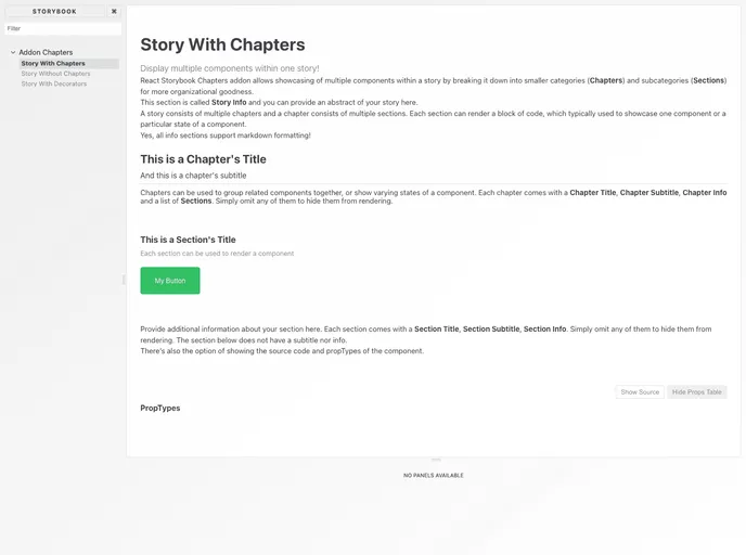
The React Storybook Addon Chapters is an innovative tool designed to enhance the experience of showcasing multiple React components within a story. This addon allows developers to organize their component documentation in a clear and informative way, making it easier to navigate through the various elements of their application. By incorporating metadata, users can provide additional context and information about each component, promoting better understanding and usability.
With its focus on enhancing storytelling in the development process, this addon not only streamlines the documentation of components but also serves as a valuable resource for both developers and stakeholders. The ability to easily showcase and communicate component usage is a significant advantage for any team working with React.
Features
- Organized Presentation: Allows for the effective organization of multiple React components within a single story, making it easy to see how components work together.
- Enhanced Metadata: Supports the addition of metadata for each component, providing extra insights and context that can aid in understanding their purpose and functionality.
- Interactive Showcase: Offers a dynamic interface where developers can interact with the components in real-time, making it easier to demonstrate changes and variations.
- User-Friendly Navigation: Features intuitive navigation tools to help users quickly find and explore specific components or stories.
- Seamless Integration: Easily integrates with existing Storybook setups, allowing teams to adopt the addon without major disruptions.
- Customization Options: Provides options for customizing the presentation of stories to fit the specific needs of the project or team preferences.