Overview
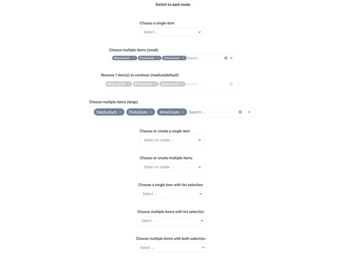
The chakra-multiselect component is a versatile tool designed to enhance your application’s user interface by providing an elegant and customizable multiselect dropdown. Built using Chakra UI, it seamlessly integrates into React applications, allowing users to select multiple options with ease. The component is perfect for scenarios where users need to make multiple choices, such as selecting items from a list or filtering results based on specific criteria.
What sets chakra-multiselect apart is not only its functionality but also its flexibility. With options for different modes, it can adapt to various use cases, making it a valuable addition to any developer’s toolkit.
Features
- Single Mode: Users can select one option from a list, streamlining the selection process for straightforward scenarios.
- Multi Mode: Allows for the selection of multiple options, making it ideal for more complex choices where numerous selections are required.
- Single + Create Mode: This mode empowers users to both select an existing option and create a new one, adding significant versatility.
- Multi + Create Mode: Combines the functionality of multiple selections with the ability to create new options, offering users maximum flexibility.
- ChakraProvider Integration: Easily implementable by wrapping your application with ChakraProvider, ensuring design consistency across your app.
- Custom Theming: The component supports customizable themes, allowing for easy integration with your application’s design language.
- Supportive Documentation: Comprehensive documentation is available to guide users through installation and usage, ensuring a smooth development experience.
- MIT License: The component is open source under the MIT License, promoting usage and contribution from the developer community.