Boilerplate for creating React component libraries, with Rollup.js ,Storybook, Typescript, Tailwind CSS, Shadcn/ui
SharedShared is a boilerplate for writing React Libraries bundled with Rollup.js. It includes support for commonJS, ES6 modules, Storybook, Tailwind CSS, and Shadcn/ui. With this project, developers can quickly start developing their own React libraries and easily publish them to NPM or their private registry.
To start developing with SharedShared, follow these steps:
git clone <repository-url>
cd <repository-folder>
npm install
npm run start
http://localhost:6060
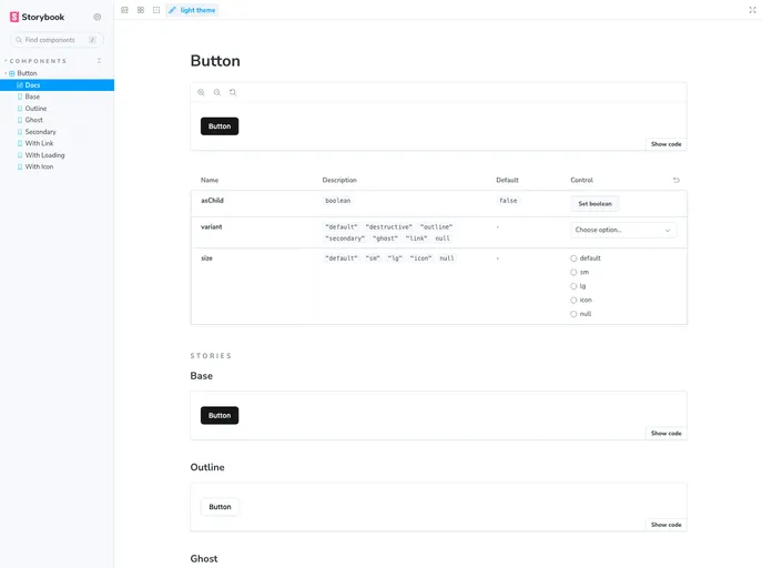
Begin developing your components in the src/components folder and update the src/index.js file accordingly. Don’t forget to provide a <YourComponent>.story.tsx file to showcase your component in Storybook.
Customize linting rules by overriding them in the .eslintrc.cjs file.
Run tests with the following command:
npm run test
.npmrc file, and update the registry URL in the publishConfig section of the package.json file. Then, run:npm run release
For more customization options, documentation, and deployment instructions, refer to the Storybook documentation.
SharedShared is a boilerplate for developing React libraries bundled with Rollup.js. It provides an out-of-the-box development environment with support for commonJS, ES6 modules, Storybook, Tailwind CSS, and Shadcn/ui. With features like linting, testing, and easy publishing to NPM or private registries, SharedShared simplifies the process of creating and showcasing React component libraries.