Overview
The semantic-ui-calendar-react is a versatile datepicker component tailored for React applications. With its recent release of version 0.8.0, the component has been optimized to be CSS-free, providing a seamless integration without the overhead of styling conflicts. This component is designed primarily with developers in mind, offering various customization options and a user-friendly interface that enhances the calendar selection process within forms.
What’s particularly exciting about this component is its compatibility with moment.js, which enables extensive locale support and customizable date formats. Developers can enjoy the opportunity to integrate a streamlined calendar into their React projects while benefiting from rich functionality that enhances user experience.
Features
- CSS-Free Design: The component is completely free of CSS dependencies, making integration straightforward without styling concerns.
- Locale Support: Utilizing moment.js, it allows for easy locale configuration both globally and locally within individual input components.
- Customizable Date Formats: Users can specify their preferred date format using any string compatible with moment().format, enhancing flexibility.
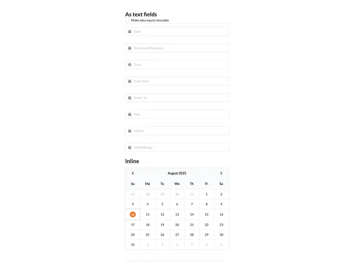
- Inline Picker Capability: By simply setting the inline property, users can display date pickers within input fields directly, improving usability and appearance.
- Dynamic Popup Position: The calendar popup can be precisely positioned according to user preference, with options for various locations such as top left, bottom right, and more.
- Clearable Input: With the clearable setting, users can easily remove any selected dates, improving user interaction and control.
- Preserve View Mode: The component can remember the last mode (day, hour, minute) the user has selected, maintaining consistency across sessions.
- Multiple Date Control: The component allows for the enabling and disabling of specific dates, providing users with control over selectable options for increased clarity in date selection processes.