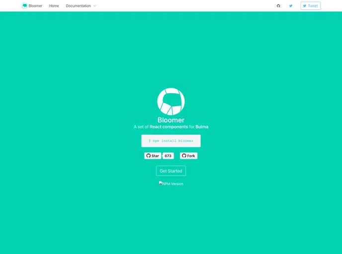
A set of React components for Bulma CSS Framework
Bloomer is an impressive library that offers a set of React Stateless components designed specifically for the Bulma CSS framework. Perfect for developers looking to streamline their UI development, Bloomer integrates seamlessly into existing Bulma projects. Whether you’re building a simple web app or a more complex interface, Bloomer provides the necessary building blocks to create visually appealing and user-friendly components.
The library is open-source, allowing for community contributions and modifications. With an active support system and comprehensive documentation, it’s easy to get started and enhance your projects with Bloomer’s components. This makes it an ideal choice for developers who value flexibility and efficiency in their workflows.
React Stateless Components: Bloomer offers a collection of pure functional components that enhance performance by eliminating unnecessary re-renders.
Bulma Integration: This library is built on top of the Bulma CSS framework, ensuring your components are styled consistently and responsively.
Easy Installation: You can easily install Bloomer using NPM or Yarn, or incorporate it via a CDN, making it adaptable to various project setups.
Comprehensive Documentation: The online documentation is detailed and user-friendly, covering everything from installation to advanced usage tips.
Open-Source Community: Bloomer is an open-source project under the MIT license, encouraging contributions and collaboration from developers.
Flexible Layout Options: The components are designed to work seamlessly with Bulma’s grid system, providing layout options that make responsive design straightforward.
Active Contributions: The library welcomes contributions, meaning it’s continually updated and improved by the community.