Сторибук компонентов React на основе дизайн системы Адмирал 2.1
React UI is a powerful component library tailored for React applications, built upon the Admiral design system version 2.1. This library streamlines the development process by providing a suite of reusable UI components, ensuring that developers can maintain a consistent design language across their projects. By leveraging the capabilities of Storybook, React UI enhances the user interface development, making it easy to visualize and test components in isolation.
The features of the React UI component library include:
Reusable Components: Modular components that can be easily integrated into various parts of your application, saving time and effort during development.
Design Consistency: Built on the Admiral design system, ensuring a cohesive visual style across your application and improving user experience.
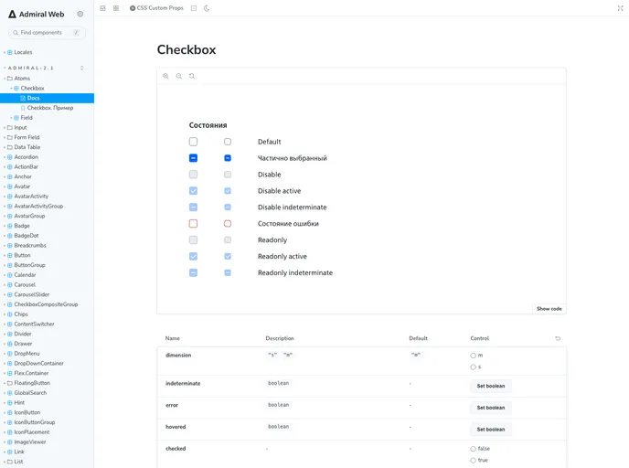
Storybook Integration: Enables developers to view and test components in isolation, facilitating collaboration and better documentation.
Customizability: Components are designed to be easily customizable, allowing developers to adapt styles and behaviors to fit their project’s specific needs.
Responsive Design: Ensures that all components are mobile-friendly and adjust seamlessly to different screen sizes, enhancing usability on all devices.
Accessibility Focused: Prioritizes accessibility standards, helping developers create inclusive applications that can be used by a broader audience.
Well-Documented: Comprehensive documentation and examples are provided, helping developers quickly get up to speed with using the components effectively.