Material UI Slider screenshot

Material UI Slider

Author Avatar Theme by Acehubert
Updated: 8 Dec 2020
17 Stars

Material-UI 1.0.0 Slider component

Categories

Overview

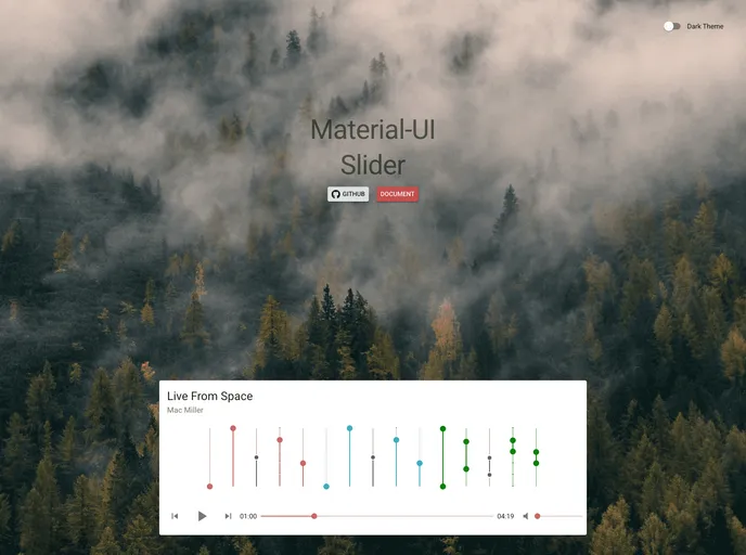
The Slider for Material-UI 1.0.0 is an intuitive and versatile component designed to enhance user interaction within your application. Serving as a graphical control element, this slider allows users to select a value or range of values easily, making it ideal for settings adjustments and other parameter selections. Whether you’re building a complex data visualization tool or a simple settings menu, this component fits seamlessly into your design.

Equipped with a variety of customization options and robust functionality, this slider stands out for its user-friendly interface and adaptability to different use cases. The ability to specify minimum and maximum values, customization of color, and range selection make this slider a highly customizable option for developers looking to create a more engaging user experience.

Features

  • Min and Max Values: Set the minimum value as low as 0 and a maximum of 100, ensuring control over the slider range.
  • Default Value: Initialize the slider with a default value or range, which can be a single number or an array for ranges.
  • Customizable Decimals: Control the precision of the output with settings that allow for a specific number of decimal places.
  • Range Selection: Enable a range selection mode by simply passing an array, perfect for cases where users want to choose between two values.
  • Direction Flexibility: Choose between horizontal and vertical orientations to fit the layout of your application.
  • Color Customization: Personalize the slider’s appearance with colors specified in HEX, RGB, or HSL formats.
  • Event Callbacks: Utilize onChange and onChangeComplete functions to track when the value changes, enhancing interactivity within your app.